A listing is usually the first thing that potential renters see about your property. With home hunters now searching online on rental websites, you have to compete with other online listings for the market’s attention. Make a good first impression.
For your online property listings to attract clients, they have to be aesthetically pleasing. The best way to achieve that is by complimenting them using high-quality and well-composed photographs of your unit. The goal is to make your property look appealing before they even see it in person. When they see photos of your unit, they need to be able to imagine themselves living in it if you want them to make an offer.
Research has shown that online listings with well-curated photographs close deals faster. In some occasions, they even get sold or rented for a higher price. An online listing sets-up the level of desirability that a client feels towards your property. This will encourage them to compete with other interested applicants and might even be willing to offer a higher rental rate just so their application will be given priority.
If you are planning to create listings for your property and publish them on listing management platforms like Padleads.com where it will be syndicated to popular rental websites, you have to be sure that your photographs will have a positive impact on the hundreds of home hunters who will come across it.
Follow these tips on how to have better property photographs:
Good lighting
Your photos must not be too dark that it’s hard to see and would feel gloomy, or too bright that it washes out details of your image.
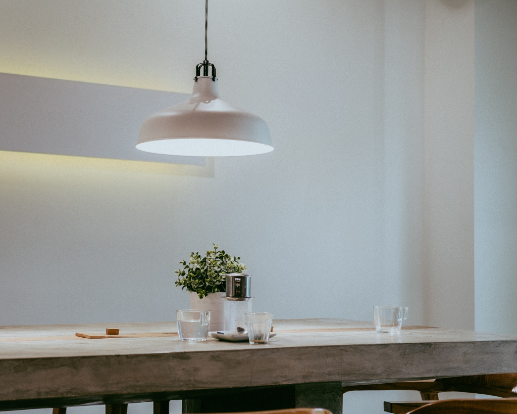
Strategically schedule your photo shoot in the daytime when the sun has just the right level of brightness to light up the interiors. Open the curtains and take a photo of your unit with the natural light source behind your back.
The same applies when taking photos of the exterior, or the facade of the building where the unit is located. This makes for a good featured image or cover photo for your listing.
Clean and organized set-up
Spruce up the place before the photo shoot. Remove clutter and make sure the entire place is shiny and free of dirt.
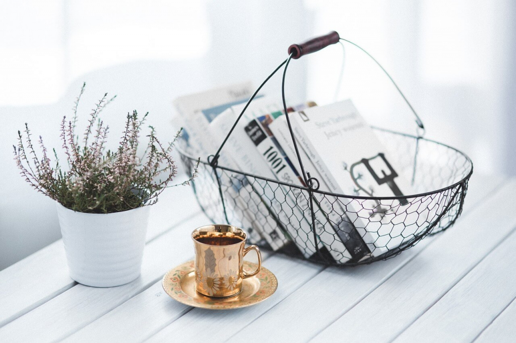
If possible, add some luxury pieces, flowers, books, or other small touches to make the place look more homey. You have to show the potential of your unit to be a place of comfortable living.
High-resolution footage
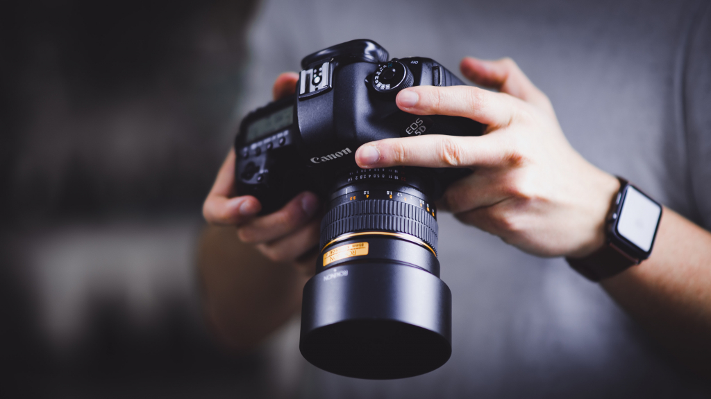
Invest on a camera with good resolution, or a professional photographer who have high-end photography tools.
Using low-resolution or blurry photos will give a tenant an impression that you don’t give importance to quality in your rental business. It can also make your unit appear unappealing, dry, and lifeless.
Avoid excessive Photoshop
Photoshop is a good tool to enhance real estate photographs in terms of color balance, brightness and contrast, and other photo elements. However, this should be used with caution.
You don’t want to overdo the Photoshop to a point that it makes your unit look completely different from how your unit actually looks like. Tenants would eventually see it when they visit and you don’t want them to feel like you tricked them.
If you already have good and well-composed raw footage, you can opt not to perform any photo manipulation.
Sufficient amount of photos
One photo is not enough to convince a tenant to rent your place. Show photos of different areas of the unit, even the hidden corners and interior of cabinets. Include the different rooms and the appliances included on the lease.
Not only can this give the tenant a better glimpse of your property, but it also sends a message that you are not hiding anything from them.